How to
Create an App
How to
Create an App
When it comes to apps, design is important. Well-designed apps are more likely to attract users, retain
users, and achieve whatever it is they’ve been created to do (e.g. generate revenue, promote another
product, educate users, etc.).
And design is about more than just creating a great look and feel. It’s also about function and
usability. Look and feel are, no doubt, extremely important.
But, unless your app functions beautifully, looks won’t get you very far.
Now, the perfect design for your app isn’t going to be the same for other apps. So coming up with a
great design is a process that’s unique to each project.
That said, there are some design fundamentals that you should know about.
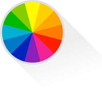
It’s hard to underestimate the importance of colour. Colour impacts us in an unconscious, emotional level. For this reason, having a basic understanding of the psychology of colour is a must for all hopeful app creators.
For the sceptical reader, here are some
interesting stats about colours and consumer behaviour
as Andrew
Hubbard states in his excellent post.
Certain colours elicit particular emotional responses and associations. And it may be a good idea to pick the colours you will use on your app based on their psychological properties.
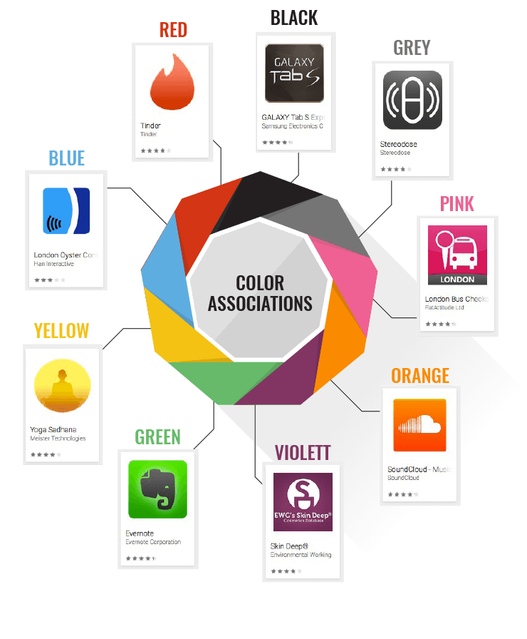
Positive associations:
courage, strength, warmth, energy, masculinity, excitement, stimulation.
Negative associations:
defiance, aggression, strain.
Positive associations:
optimism, confidence, self-esteem, extraversion, friendliness, creativity.
Negative associations:
irrationality, fear, fragility, depression, anxiety.
Positive associations:
spirituality, luxury, authenticity, truth, quality.
Negative associations:
introversion, decadence, suppression, inferiority.
Positive associations:
tranquillity, nurture, femininity, love, sexuality, warmth.
Negative associations:
inhibition, claustrophobia, emasculation, weakness.
Positive associations:
intelligence, communication, trust, efficiency, serenity, duty, logic, calm, reflection.
Negative associations:
coldness, aloofness, emotionally lacking, unfriendliness.
Positive associations:
harmony, rest, balance, refreshment, love, restoration, outdoors, peace, reassurance.
Negative associations:
boredom, stagnation, blandness, fatigue.
Positive associations:
comfort, food, warmth, security, sensuality, passion, fun, abundance.
Negative associations:
deprivation, frustration, frivolity, immaturity.
Positive associations:
psychological neutrality.
Negative associations:
lack of confidence, dampness, depression, lack of energy.
Positive associations:
sophistication, glamour, security, emotional safety, efficiency, substance.
Negative associations:
oppression, coldness, menace, heaviness.
Tapping into the psychological properties of colours can help you convey what you’re about in the quickest,
most effective way without the need for lots of descriptive words. And you can also use colours within your
app to combine certain emotions with certain functions.
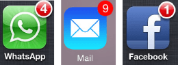
For example, many apps use red to signify new notifications no matter what colour scheme they choose for the
rest of their app. Aside from drawing their attention to the stand-out colour, this helps users see new
notifications as exciting and stimulating.
Here are a few other facts about colour:
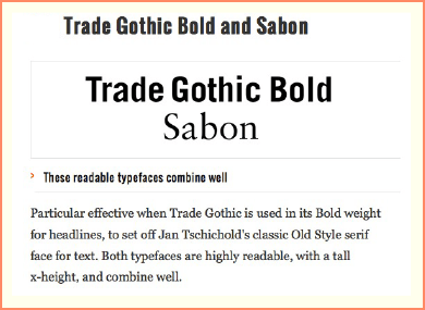
Fonts, as with colours, can have a huge emotional impact on users.
The font you choose is your brand’s voice. And so certain fonts are more appropriate for certain apps.
Round, playful fonts, for example, may attract children or signify that your app isn’t too serious.
Whereas sharper fonts may have more serious connotations, and imply authority.
Bear in mind that particular fonts work well with others (you can see a great list of complementary fonts here), and that certain fonts may already have certain associations (comic sans is often seen as childish and unprofessional, and courier is often seen as retro and antiquated).
Stick Man Snowboarder uses an exciting, chunky, and icy font with a warmer, smaller and differently angled font. The fonts complement each other well, appeal to the app’s target demographic, and are eye-catching enough to draw attention on the Apple App Store.

Visual appeal comes from colour, design, and button placement.
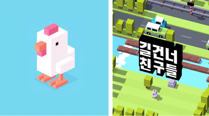
Crossy Road, below, has been
lauded for its innovative and beautiful design.fonts may have more serious connotations, and imply
authority.
Again, there’s no one perfect layout, and arriving at the one that best suits your app will be a process of trial and error.
The best way to nail your app’s layout is to carry out design and research at the same time. Sketch out
and list potential user flows (you can write them out, sketch them, or map them out digitally), and see
the possible ways users may navigate your app. Play about with different paths and see what works best.
If you’re working with a designer, you can use project management tools like Invision and Asana to share your ideas quickly
and easily – and for free. They’re ideal collaboration tools the make you and your team more efficient
and productive when simultaneously working on such a project.
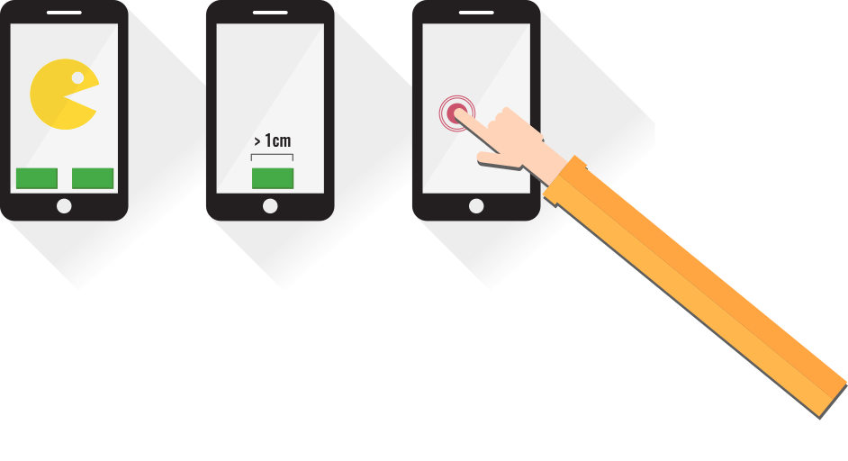
And remember to incorporate standard device movements and gestures – swiping, pressing, drawing the
fingers apart, pushing them together, and so on. The less unique gestures your users have to learn, the
quicker they will be able to navigate your app efficiently and intuitively – app users don’t like
learning new things so...
make it as familiar
and as easy as possible!
Stacks 2 is a beautifully designed currency conversion app. The app was featured on several Best Designed Apps lists due to its simple, intuitive interface and thoroughly useful function. However, the app lost points because of the new and hidden gestures the app attempted to introduce to its navigation.
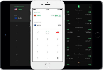
Image credit source: http://venturebeat.com/2014/12/28/the-14-most-beautifully-designed-apps-of-2014
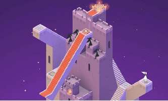
Monument Valley, winner of Apple’s Game of the Year 2014 award, has also been praised for its beautiful and sophisticated design. The game’s artwork and design, combined with its controls and ingenious puzzles, led to the game becoming incredibly popular – with more than 4,000 reviews across Apple’s US and UK App Stores averaging 4.5 stars.
Taking each of the aspects highlighted throughout this chapter, Dhru explains the process and essence of HaikuJAM’s layout and design:
Once you have settled on a skeleton design, you need to make sure that your users will love it as much
as you.
The best way to find out whether they do is by running some remote usability tests. There are plenty of
companies that offer this service, and a key benefit is that they allow you to see how people use your
app in a natural setting. This will show you what aspects of your app they like, as well as where your
app goes wrong.
Usertesting.com offers a
Basic Package, including video and audio of your app being used, including testing on computers, phones,
and tablets, for $49. They also offer a Pro Package, which include benefits such as demographic filters,
moderated usability testing, competitive benchmarking, highlight reels, and more.
3diusability.com offer a more
flexible service that integrates with the way their clients want to work. The company’s usability
evaluations are bespoke packages consisting of specially designed usability tests and in-depth
reporting. This service is available from £1450 + vat.
If you’re working on a budget, you can always ask friends and family to download the app themselves and
watch how they use it. Whilst not as comprehensive as professional usability testing, this should still
flag up any major problems.
You’re unlikely to nail your
design first time, so after each test
be prepared to make changes and take
all feedback constructively.
Once you feel you’ve removed the first set of problems, send your new design for testing too. Repeat
this process until your users are happy, and when you launch, your app is sure to navigate like a charm.
The benefit of conducting robust testing across every platform is significant, as Marty Zwilling, CEO & Founder of Startup Professional
Musing, and Advisory Board Member for multiple startups, highlights:
Design is so much more than simply making your app “look pretty”. Although smartphones are getting larger, with far greater quality graphical displays, they still have relatively small touchscreens. Design is therefore fundamental to not just the usability and navigation of your app, but the emotional connection you want your users to make with it too. You want them to enjoy the experience, keep coming back for more, and to rate it highly with positive reviews too!
This chapter details everything from which colour to use for the type of app you are developing and the
emotional response you want to spark, to font style and spacing, and from layout to usability. Just be
sure to test, test and test again to make sure...
that your users are
wowed as much as you are!